Category: Exhibitions

Vibration in Wayne Thiebaud’s work

Museum Voorlinden, Wassenaar

9 June 2018 – 28 October 2018 

The works of Wayne Thiebaud (b. 15 November 1920) were vaguely familiar to us given his inclusion in an exhibition on American realist painters at the Emden Kunsthalle earlier this year. Consequently, we had some notion as to what to expect when about to cover a first European retrospective of Thiebaud’s works at Museum Voorlinden in Wassenaar, South Holland. Upon entering the exhibition at the beautifully designed museum we were struck by his seemingly ordinary paintings of cakes, pies, ice cream cones and hot dogs.

But then upon closer scrutiny we were surprised to see a great variety of colors in thick blotches of paint making up the objects on display. Also, curiously enough, the cakes, pies, etc. were painted, as it were, in isolation. An ice cream cone all by itself, or lonely hot dogs. Pastries were either placed on an isolated shelf or in a singular case, leaving it up to your imagination as to their actual location. In addition, Thiebaud’s pastry objects exuded the use of heavy pigment, exaggerated colors and shadows.

Pop Art or not?

In fact, Thiebaud says he was drawn to these objects precisely because they were commercially made, as if they were off the production line. But pastry objects were not his first ambition. He began drawing when in his teens. At the time he largely drew cartoons and illustrations. He also made posters for theaters, was taken on as an apprentice at Disney Studios and In 1942 he enlisted in the U.S. Air Force where he worked as an artist in the special services unit.

After the war, he was employed to paint images for signs as well as to create a special design for license plates that were used by the State of California to raise extra revenue. The style adopted by Thiebaud in the 1940s resembled abstract expressionism, illustrated by the extremely large mural he made for the Sacramento Municipal Utilities Distribution Building (250 feet long and 15 feet high). The mural drew attention precisely because of its similarity to a work of abstract expressionism. Meanwhile, in his mid-20s Thiebaud travelled to New York where he obtained work as a free-lance cartoonist.

Upon returning to California one year later he enrolled in San Jose State College and subsequently at the California State University at Davis in Sacramento, California where he remained as a teacher until 1991. He returned to New York some ten years later in 1956 where he became friends or acquaintances with some of the great exponents of abstract expressionism such as Willem de Kooning, Fritz Kline, Rauschburg and Jasper Johns.

At an exhibition held by the Allen Stone Gallery in New York, he also had the opportunity to join what is now known as the Pop Art group, including the Pop Art artist of great repute, Andy Warhol. As a result of Thiebaud’s participation in this exhibition he was, at first, identified as a member of the Pop Art school of art. This, however, was not the case. What was Thiebaud’s opinion on the dominant abstract expressionism as exemplified by De Kooning and Pollock? According to a quotation from Thiebaud in an article by Ian Parker in The New Yorker: ‘ I’d been painting like De Kooning and Pollock, and trying to make it look like art. You develop those convenient signs of art – the drip, or whatever those things use’.

Haloes

But why are pastry objects of such fascination to Thiebaud? In several interviews Thiebaud tells of his experience growing up in Long Beach, California. He used to stop in front of a pastry shop while walking near home and gaze at the delicious-looking cakes, donuts and pies. Moreover, aside from this inspiration, Thiebaud became more interested not so much in these objects as such but rather in how he could portray them on a canvas. Through experimentation, he discovered that by providing the objects with an external halo of paint the relationship of the different paints would actually seem to vibrate.

Thiebaud applied the paint in such a way that the texture actually resembles thick cream, smooth frosting and streaks of mustard. His own term for this is ‘object transference’. He has no cakes or pastry in his studio and paints them from imagination and memory.

But what did Thiebaud believe was his true style? In a quotation from an article in another New Yorker article this time by Rose Glaser Friedrick, Thiebaud says: ‘ I’m just essentially a traditional painter, and by that I mean, always interested in imagery, trying to make a representational painting that has as much abstraction as seems to fit that particular mode of representation’.

In a further definition of what Thiebaud believed he was doing, he told Martin Gaylord in the Apollo Magazine: ‘ I don’t have much to do with realism; there’s a big difference between realism and representation’. Taking a note from Willem de Kooning who described the style of Thiebaud from Thiebaud’s perspective: ‘I’ve got a wolf’s brush that makes terrific lines. That’s what you use, it all comes out of these’.

A sense of immediacy

We can better understand the purpose of Thiebaud’s halogens outlining his paintings by reviewing his figurative works for they, too, are activated, so to speak, by the application of lines of paint which give the work a sense of vibration and energy. Take, for instance, his portrait Robed Woman with Letter. The letter on the table top in front of the woman is ringed with a line of yellow paint. We know this is done in black on the occasion of death notices, but here it gives a sense of liveliness.

Moreover, even though the portrait is done straight on and the woman’s expression seems to be without a strong emotion, one has the feeling there is something personal going on here. But what is it? We feel her presence. Why are her arms straight down where you would expect them leaning on the table? Has the letter already been opened or not yet? The halogens around the letter and the table seem to give it all a sense of immediacy. Both people and objects seem to stick out against their backgrounds, thus almost coming alive. It is almost like poetry where unusual word combinations and metaphors stir images in its readers.

Here, observing Thiebaud’s work, we sense a certain rhythm in Thiebaud’s paintings, an atmosphere, a whole world behind them. We are aware that something must have happened just before we approached the scene, which makes us almost like priers. It is as if we were not supposed to be here. Yet, we stare and gaze.

Why are the two women and three men in Five Seated Figures (1965) in a circle without looking at one another? Two chairs are turned around completely. The whole group is wearing festive clothing, matching shoes, all shiny, and their hairdos look immaculate. But where is the party? Where are the drinks, the chatter, the laughter?

They are sitting stiffly on straight chairs with straight faces, hands resting in the lap and one man with his arms crossed. Are they angry? Something must have transpired and apparently it is something they cannot share. We happen to stumble upon them and what to do now? How long are they going to maintain their position? Obviously forever, but they seem so real that we are drawn into their lonely circle, at the same time feeling we should actually sneak away, apologizing for intruding.
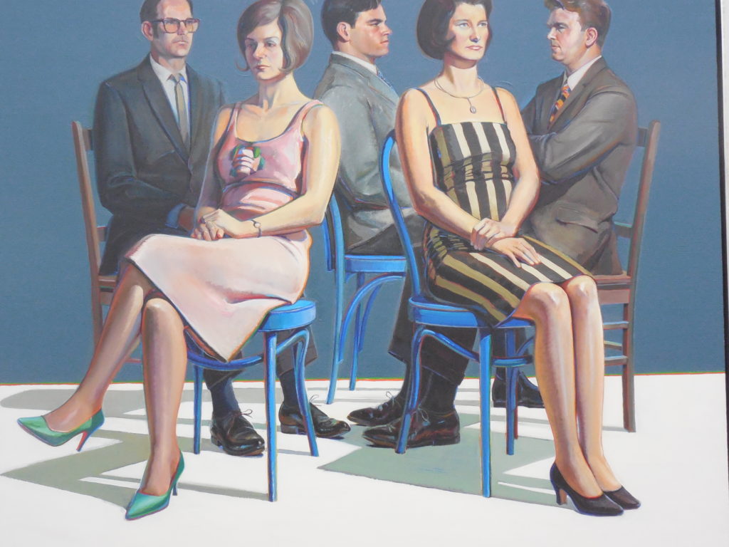
Five Seated Figures

The same holds good for the almost life-size Standing Man (1964) who is dressed in a poor suit, at least two sizes too large and with two buttons, but only one button-hole. The shabby suit has been ironed, though, because there are no creases and the pants are neatly pleated. His skinny neck sticks out, his head is slightly tilted. He looks forlorn and uncomfortable with his hands dangling along his body. He is standing against a beige wall and on a beige floor, separated by a yellowish line.

His polished shoes, like the suit, are so large that you suspect the whole outfit has been lent to him. Apparently he needs it for a serious occasion. We want to know what is going on. We want to reach out instead of gawking at him and adding to his discomfort. This is the thing: the people in the paintings look alive, not only because of the colors, their shadows, the lines in the background, but also because we seem to catch them in the middle of a personal story.

The Girl with Ice Cream Cone (1963), as usual Thiebaud’s wife, in her bathing suit looks at us. She looks sexy, no doubt about that. At the same time she looks as if we are in her way as she was just enjoying her ice cream. We have entered this part of the beach that was hers just a moment ago. Her bathing suit, in a way, reinforces our sense of trespassing, for there are trees and hills on it, also between her legs which are slightly apart. Again, what is happening here? This is a painting and we can have a close look if we want to. It is in the museum for us. Yet, we almost feel as if we are imposing upon her.

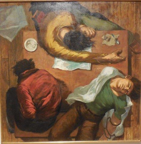
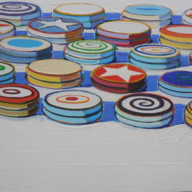
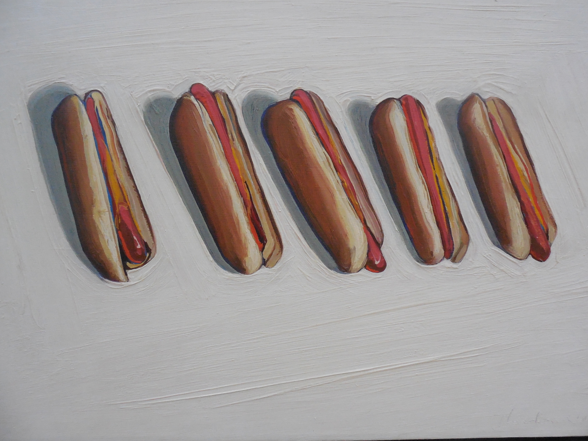
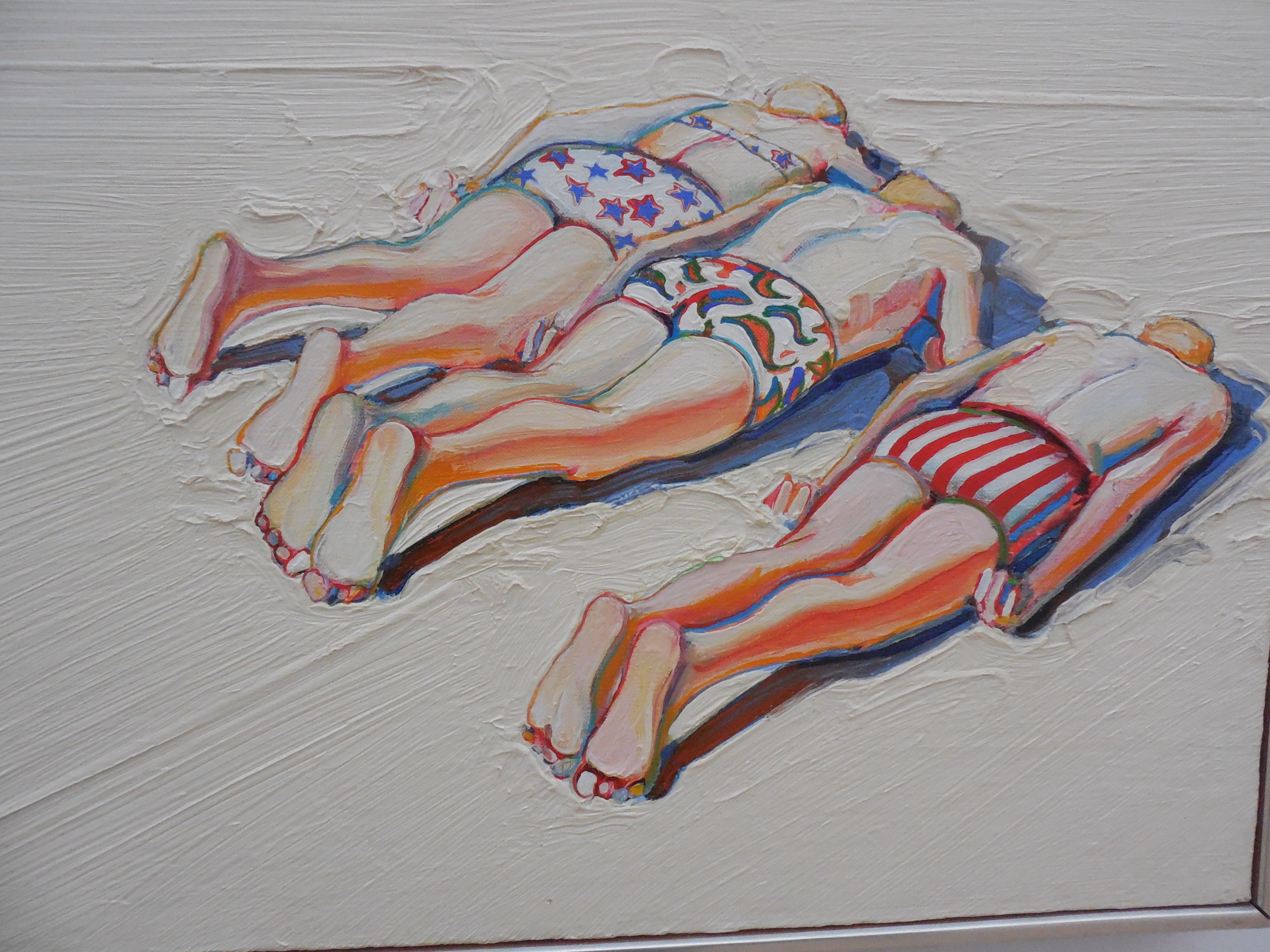
Some people in the paintings make us laugh, for instance two men and a woman on the beach, faces down. Their position cannot be comfortable. They are wearing colorful bathing stuff, which suggest this is fun, but where are the towels? Are their faces in the sand? The people are grouped like the pies, ice creams, the hot dogs. Five Hot Dogs (1961) is even on the same wall, looking quite unappetizing with the mustard oozing out. Involuntarily, you compare these works and chuckle.
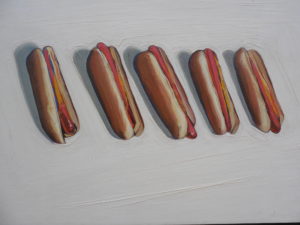
 

A swaying street

When moving from the pastry and figurative still lifes to the cityscapes, the third category of Thiebaud’s work, we move back again to a form of abstract expressionism or even to a kind of realistic surrealism. Although we know these paintings depict a scene in San Francisco or an outlying area about the city, the resemblance on the basis of representational style is far-fetched. The street, for example, directly in the center of his Intersection Buildings (2000 – 2014) appears to be moving up just as if it were a bridge which has been raised as if to let ships go by. The strong colors, too, make the street almost sway.

The exhibition is the first Thiebaud retrospective in Europe and thanks must go to the work and passion of director Suzanne Swarts for enabling us to see this very unusual and fascinating artist, who – in his 90s – is still working and playing tennis. Vibrant in person, vibrant in his paintings.


The American Dream – part 2

The American Dream, Kunsthalle Emden, Germany

Kunsthalle Emden Drents Museum, Assen – the Netherlands & the Kunsthalle, Emden – Germany 19-11-2017 – 27 May 2018

The exhibition The American Dream now being shown in Assen, the Netherlands and Emden, Germany, is a cooperative project whereby an attempt is being made to clarify ‘variants of realism’ and to demonstrate how the artists interpret ‘The American Dream’. The Drents Museum concentrates on American realism from 1945 to 1965, while Kunsthalle Emden is primarily devoted to American realistic art from 1965 to the present.

After a visit to the Drents Museum in Assen (see review The American Dream 1) it was time to go to the Kunsthalle in Emden. Looking through the trees with their green leaves, a brightly lit arrow on the façade of the museum lit up, almost beckoning us to come in. This is the place to be, it seemed to say, and indeed, it was. The entire exhibition will be a wake-up-call for many, including for Americans themselves, as realism as an art form has taken second place on the American art scene to abstract expressionism.

The curators have prepared visitors well with an excellent introduction to the show by selecting several works which serve as guideposts to the exhibition as a whole. The choice of Edward Hopper (1882-1967) and Andrew Wyeth (1917-2009) as the primary representatives of American realism was made with the recognition their works provide a standard upon which to view the exhibition as a whole. With their realistic work they stand out against abstract expressionism, photography, photorealism and hyperrealism.

Hopper and Wyeth: light

In the first gallery Hopper Hopper is represented by his ‘Girl at a Sewing Machine’ (1921) and Wyeth by ‘Blue Door’ (1952) and ‘Lovers Study’ (1981). Both artists have placed their figures in natural sunlight shining through a window with accompanying shadows. Hopper’s light is subdued, whereas Wyeth’s is sometimes extremely bright.

The girl in Hopper’s painting ‘Girl at a Sewing Machine’ seems to be completely absorbed by her sewing, while Wyeth’s nude woman in ‘Lovers Study’ is obviously posing for the artist who shows details like the light stroking her pubic hair and thighs and part of her left ear sticking out through her tight braids. Hopper, with a touch of impressionism, concentrates on form, while Wyeth shows a different kind of precision and explicitness. Both paintings are fabulous, especially as they implicitly seem to tell us something about their makers.

Wyeth’s painting, ‘Blue Door’, approaches abstract expressionism, but it remains a realistic door reflecting sunlight from a nearby window in a ramshackle barn.  Here the sunlight is quite dim when compared to ‘Lovers Study’. The light falls against the door and woodwork in varying shades of blue. The place seems to be cold and gloomy, yet we want to be there. The window within the brownish sill must be hard to open. Yet, this is exactly what we want to do. We almost feel the wind and hear the wooden floor creak. It is the intimacy of the barn that draws us in.

Both Wyeth and Hopper want us to recognize what they are depicting, although their work is mysterious at the same time. They share a love for the cinema, which often shows in Hopper’s work where we view a frame, as it were, from a film strip. These picture frames are often interpreted in terms of such moods as alienation and loneliness.

Larry Rivers

The introductory room further includes work by Larry Rivers, John French Sloan, John Koch and Charles Steeler. Larry Rivers’ work (1923-2003) is considered to be a bridge between Abstract Expressionism and Pop Art. His ‘Double Portrait of Berdie’ is an early work not yet reflecting his venture into Pop Art.  This painting was regarded by some as a ‘shocking female portrait’. He was criticized for ‘his crude depiction of his aging mother-in-law’. She sits and stands by a bed with vaguely flowery sheets, her big hallux valgus toes sticking out and growing over the other toes. It is a realistic and somewhat impressionistic depiction of a naked older woman. Not shocking now, but at the time apparently it was.

According to Andy Warhol, ‘Larry’s painting style was unique and it wasn’t Abstract Expressionism and it wasn’t Pop Art.  It fell into a period in-between. But his personality was very Pop’. Warhol also said Rivers was ‘the daddy of ‘Pop Art’ and called him ‘so chic’. The inspiration worked both ways, for Rivers had encouraged Warhol to paint everyday commercial objects. Don’t we all know Warhol’s vague representation of a camel on the Camel cigarette packet?

City Life: order and chaos

In connection with the exhibition John Koch: Painting a New York Life, Grady Turner says in an essay for the New-York Historical Society that ‘there is a studied informality’ to ‘The Forbes Family Portrait’ (1956) by John Koch (1909-1978). The family, two parents with their four children, are on their patio at the side of their swimming pool on what apparently is a cloudy day as there are no shadows to be seen. With respect to this oil-based painting, the modernist Koch explains ‘what is more important than whether there is or is not someone posing for you is the relationship between them’.

What is it then? At first sight the painting looks like a photograph with a very serious family gazing in the lens, the mother even appearing quite anxious. They all seem to be so organized, so quiet. No children’s chattering, no stains or spots, no smiles, no interaction. Both literally and figuratively, there are no ripples in the water.  Is this why this intriguing and detailed painting also makes us feel slightly uncomfortable? His pictures celebrate refinement—of material, of craftsmanship, of manners and, so far as a silent art can do so, of social speech”. This work by Koch leads us to work by the artist Edward Melcarth (1914-1972) who was friends with Malcolm Forbes. Moreover, Forbes was apparently his benefactor.

One could easily say that Melcarth was the antithesis of  The American Dream, when it comes to sexuality and politics.  He was an explicit homosexual and his adherence to Communism was accompanied by a ‘sensitive, emotional and heroic portrayal of the male working class figure’.  His painting, called ‘Private Worlds’ (no date), depicts three men splayed out over the table, probably after having taken drugs. On the table are a teaspoon and an open pocket match box. They look exhausted and disheveled and we can see only one man’s face. He has his eyes closed and actually looks like a boy, which makes the scene even more disconcerting. We see the young men in their colorful t-shirts from above: a panoramic view, a form which is often used to zoom in on beauty, thus reinforcing the focus on quite another side of city life.

E. Melcarth, Private Worlds

The room, entitled City Life, also includes four small rectangular oil-on-canvas paintings by Dee Shapiro (1936 – ), which present an overview of a city under the title, amongst others, ‘View from White Street’ (2000).

City Life is also a theme of the photographer Bill Rauhauser (1956) in depicting life in his home town of Detroit. In one of the eight photographs, ‘Stone Burlesk’ (1960), a nun and a rather plump woman with a very low bosom, a stiff handbag and very practical shoes are standing before strip joint entitled, Stone Burlesk. They stand out against a background with the phrases ‘World’s Hottest Strippers’ and ‘you must be 18 or over to enter’.  We cannot help smiling.


B. Rauhauser, Stone Burlesk

The City Life room of the show also focuses on such urban photorealist artists as Latvian-American Vija Celmins’(1938 – ) ‘Tulip Car’ (1966), ‘Scotton Inn’ by Robert Kniewek (1951- ), ‘A Bend in the Road’ (2003/04) by Stone Roberts, ‘Potrero Golf Legacy’ (2012) by Robert Bechtle, ‘116th Street’ (1992) by Daniel Greene (1934-), ‘Saturday Evening: Summer’ (2009) by John Moore (1941 – ), ‘Coffee’ by Max Ferguson (1959 – ) and a photorealism picture of a movie theatre featuring the film ‘Goodbye, Norma Jean’ entitled  ‘Martin Theatre, Harrison Avenue, Panama City Florida (1976) by Stephen Shore (1947  – ).  Shore’s work is a chromogenic color print.

Countryside

Moving to the Countryside Gallery there are six oil-on-canvas works, one in acrylic, one in chromogenic print and one in gelatin silver. Kurt Knoblesdorf’s (1979 – ) oil, entitled ‘Naval Yard’ (2009), appears to be a tottering two-story white house with a brownish colored roof over a long front porch. The object is set with a dark blue sky background, a lone tree to its side and a dark yard in front. Robert Birmelin’s (1933 – ) ‘Metaphysical Rock Group’ (1970) is a rock-covered beach on a lake which fades into a hilly horizon on the other side and a hazy sky.

Neil Gavin Welliver’s (1929-2005) ‘Snow on Alden Brook’ (1983) shows a small stream, a lot of snow, both depicted by strong brushstrokes and subtle dollops of paint, brownish trees trunks cutting through all of this whiteness. Welliver had begun by painting nature as directly observed. Later he says about his paintings of the Maine woods that it was ‘not  light in the normal sense, light bathing objects, but light in the air, flashing and moving like a flow of energy through space’ and that this is what his paintings are about.

Intriguing

Nicole Eisenman (1965 – ) presents us with an intriguing ‘Long Distance’ (2015), a work which keeps us talking as to what is going on. We see two figures, one looking at the other who is looking back from a screen. The one we see from the back is wearing a red and black hunter’s shirt and tennis shoes plus a baseball cap, feet with sneakers on the table on the left of the screen, while the right hand is holding a mug. We only see the eyes, hair and feet of the other person, who is apparently lying on a bed. Boy – girl? Girl – boy? Two boys? Two girls? The suggestion is that this could be anybody: us, our children, our neighbors. The screen in the middle of the painting is like a frame within a frame, almost like a prison. Form and content seem to reinforce each other and breathe a sense of loneliness, almost as if to say: is this how we communicate?

N. Eisenman, Long Distance

In the hyper-realistic work ‘Market Basket Harley’ (2007) by Tom Blackwell (1938), we see a Milwaukee-made Harley Davidson in all its glory standing idly aside a sign announcing a number of food products such as pizzas, gourmet foods and organics.

Blackwell says: ‘I have discovered that translating the image from the photograph requires the most intense discipline and that limiting the arena of self-expression also refines it…the photograph is a tool which enables me to freeze the ‘ordinariness’ I am after, one which helps me to achieve the veracity that makes it possible to capture the ineffable in the commonplace’. Blackwell says he is devoted to the total appropriation of the object, in this case the motorcycle.  This is a protest against those artists who are satisfied with a partial presentation of the object.

Genre and still life

Moving on to the room, named Genre, we have a work in pencil entitled ‘Hillary Clinton’ (2016) by Karl Haendel (1976). It is a huge photorealistic portrait (261 by 434.3 cm) of the recent presidential candidate in what seems to be a somewhat perturbed mood.

It cannot be a coincidence that, further in Genre, Peter Saul’s (1934 – ) ‘Quak-Quak, Trump’(2017), a portrait of the current president, is on the opposite wall: a huge, cartoon-like setting (198.1 by 304.8 cm) together with surrealistic duck-like heads sprouting out of a floating hamburger with boxing gloves, hitting Trump’s head.  There are also a few little ducks squirming in his voluminous hair that he tries to shoot. Sometimes successfully, considering the blood drops splashing around.

In the Still Life category, the Emden Kunsthalle rooms exhibit ten American artists with heavy concentration on new artistic styles of photorealism and hyperrealism, developed during and after the 1960s.  Charles Bell (1935-1995), for instance, is represented by his hyper-realistic pastel ‘Before the Journal’ (1986).  In sharp detail, he shows three cartoon-like figures – a monkey in costume on a tricycle, a toy clown on a wooden horse and another dressed-up monkey on a red toy car.  Further, the hyper-realist work ‘Queen’ (1976) by Audrey Flack (1931 –   ) is enamored by odds and ends sitting on a dressing table. She uses acrylic paint to show in richer than life colors, among others, a locket, a chess piece, a rose, the queen from a deck of cards, an old-fashioned pocket watch and a slice of an orange.

Few if any kiosks are so neatly stacked as Ken Keeley’s ‘Newsstand’ (1989). Keeley (1946 – ), which displays magazines, newspapers, candy bars, lottery tickets, each particular item clearly shown for all to see, included – of course – The New York Daily News, The New Yorker Magazine, Forbes Magazine and Life Magazine with a full page picture of the actor Clark Cable starring in ‘Gone with the Wind’.

Hyperrealism, partially because Abstract Expression shows little and impressionism only suggestively so, is an attempt to make everything absolutely clear – not merely to imply or infer.  Ralph Goings’ ‘A1 Sauce’ (1995) is a good example of this style, especially because it portrays an everyday meal’s consummation product.

Catalogue

The catalogue also includes two oil paintings by Alice Neel (1900-1984), a portrait of Raphael Soyer (1970) shown in Assen, and a still-life ‘Black Bottles’ (1977) at Emden.  The still-life is limited to wine bottles together with a bowl of apples sitting on a tannin-colored table top in a fragment of a white-colored room and hallway all set off by a reddish floor. The still-life is somewhat of an anomaly as the greater part of Neel’s oeuvre consists of portraits. At first she concentrated on nude females and later in her career on personalities she encountered in Greenwich Village and Harlem in New York. Not only are her portraits  characterized as possessing an ‘intense humanity’, but also, according to Victoria Miro in The Guardian, ’a unique window on the changing world in Harlem in the years before and after civil rights’.  She provided us, says Miro,‘with a true picture of urban life in Manhattan’.

A not too minor criticism with respect to the catalogue is the failure to provide page numbers of paintings by the artists in the index.

Time to relax

Last but certainly not least, the Tiffany Lounge with its reading table, glass lamps, special Tiffany windows, art-deco chairs, sherry glasses almost tempted us to pick up one of the books and relax. However, it was not until we entered the diner that we took time to catch our breath. We sat down on the red-white seats at a white table with silver chrome legs, while watching films about feminism and other movements in the 1960s and 1970s.

The timeline on the wall is not only accurate, but also looks playful and appealing because of its form. Protruding wooden blocks with historic events written on them, all ‘hanging’ on blue stripes of paint on the wall, tell us all about the development of The American Dream.

Inviting

The exhibition is an excellent introduction to American Realism. Although some aspects of American realist paintings have been omitted such as Precisionism, we are presented with a general overview from Impressionism to Regionalism, Social Realism, Abstract Expressionism and Pop Art and lots of other art forms.

The arrow on the facade of Kunsthalle Emden, inviting you in for The American Dream, will not be there for much longer, but there is still a quite astounding permanent collection.


The American Dream – part 1

The American Dream, Drents Museum Assen

Drents Museum Drents Museum, Assen – the Netherlands & the Kunsthalle, Emden – Germany 19-11-2017 – 27 May 2018

There seems to be a revival of interest in the art world for the artistic scene in the United States. In New York, the Metropolitan Museum is currently staging a retrospective of works by the 19th century realist landscape painter Thomas Cole and the Ashmolean Museum in Oxford, UK will be showing an exhibition entitled America’s Cool Modernism featuring works by Georgia O’Keeffe, Edward Hopper and Charles Sheeler. Moreover, a show of the realist paintings of Andrew Wyeth has just been completed at the Seattle Art Museum in Seattle, Washington.The Drents Museum in the Netherlands, in cooperation with the Kunsthalle in Emden, Germany is presenting an overview of American realist paintings dating from 1945 through 2017, entitled The American Dream. We visited the Assen exhibition first.

This exhibition is a wonderful opportunity for Europeans to become more aware of what has been going on in the USA, partially in protest against the dominant abstract expressionism movement, best exemplified by Jackson Pollack and Willem de Kooning.

The introduction to realism in American art works depends in part on the historical context in which artists found themselves relative to art in America as such. For example, Thomas Cole was instrumental, along with Frederic Edwin Church and John Frederick Kensett in stimulating a new generation of 19th painters who opposed so-called academic realism.

At the same time, many artists in the States were confronted with a new style of painting emanating from Europe. The American reaction to European art was an attempt to create an ‘artistic language’ of their own. A ‘new academism’, initiated by Robert Henri, emerged in favor of a more realistic style.

Later, Henri became a teacher at the Art Students League of New York, one of his students being Edward Hopper who is one of the stars of the Assen exhibition. As a consequence of Henri’s influence, Hopper retained the realistic style with an impressionistic flavor. He went to Paris to see for himself what was going on and was influenced by the works of Edouard Manet and Edgar Degas. In his Burlington Magazine article on Hopper, David Anfam says that in the face of cubism, surrealism and abstract expressionism, Hopper was ‘bellweather of 20th-century culture’ and that he ‘concentrated on the relationship between the self and reality, the watchers and the watched’.

Every-day American life

Hopper, however, never wanted to join the group of American realist painters, depicting every day American life in rural areas and in urban centers. Artists belonging to this rural landscape style, also shown in the Assen exhibition are the early 20th century artists, Charles Burchfield, the brothers Moses and Raphael Soyer, Norman Rockwell, Andrew Wyeth and Thomas Hart Benton.

The last-named was probably the most famous of these early 20th century realist artists. His ‘Homestead’, shown in Assen, is a strong semblance of loneliness in rural America.  The picture consists of a farmer sitting on the edge of a brick well, three hogs eating their meal and in the distance an old-fashioned windmill next to a shed with an isolated tree in the background.

We can also see Charles E. Burchfield’s ‘November Railroad Mood’, a magical realistic depiction of a gathering storm in the background and a railroad line in the foreground. The watercolor is done in black and white with shades of grey.

Meanwhile, the realist painter with the longest longevity in this genre, Andrew Wyeth, is represented here by several paintings including ‘McVey’s Barn’ and ‘Toll Rope’. These works were done with tempera, or egg yolk and oil, which provide intimate detail and great clarity, showing his great love for his surroundings, for what we would assume to be everyday common objects. His most famous and mysterious work, ‘Christine’s World’, is not included in the exhibition, but there is his ‘Barraccon’ which shows his model and secret lover Helga Testorf lying on a couch with her back towards the viewer.The work is done as if she were the black maid who worked at his neighbor’s farm. That it was of Helga remained a secret.

Abstract Expressionism

A great majority of the American artists being shown in this exhibition were born before 1945. Only a few of these, however, were able to withstand the influence of the dominant style, abstract expressionism. Both Andrew Wyeth and Edward Hopper did retain their respective styles throughout their career. The brothers Moses and Ralph Soyer stuck decidedly to their version of social realism, otherwise called urban realism.

Artists such as Fairfield Porter, John McCoy, Charles Burchfield (1893-1967) and Robert Mirmelin are known primarily for their concentration on specific themes, domestic scenes in the case of Porter, and landscapes in the cases of McCoy and Burchfield.

Porter’s ‘A Day Indoors’ is typically a relaxed domestic scene, but in colors not encountered in most homes at the time. John McCoy’s ‘Four O’clock Train’ and ‘Brandywine at Twin Bridges’, both in tempera, are unusually precise in a display of nature at its best. Mirmelin stresses urban landscapes ranging from ‘A Subway Experience’ to ‘Landscape Homage to C.D. Friedrich’ and the ‘Metaphysical Rock Group’.

Alice Neel, Alex Katz  and Will Barnet express an obvious movement from figurative representation to abstract expressionism. Neel, for example, moves from the detailed portrait ‘Portrait of Raphael Soyer’ to the still life ‘Black Bottles’ where form is emphasized at the cost of detail.  Katz, for his part, has managed to incorporate both realism and abstract expressionism in the portrait of his wife, entitled ’Ade’. This development in style is also exhibited by Will Barnet’s more abstract ‘Woman Reading’ as against ‘Upstairs’, both of which show a rather abstract look wherein the first may evoke a smile and the last – possibly – a tear.

Photography

In the latter part of the 20th century, the Assen exhibition shows us that photography enters the art scene thereby enhancing realism as the choice of style rather than abstract expressionism. Especially Brunelli establishes photo realism as an art form in his work ‘Court Chenage’. He is applying the method of photo realism, whereby the content shown in a photograph is the source which is then reproduced piecemeal by using oils applied to canvas. His photo realism follows Andy Warhol’s pop art. This style coincides with methods also used by Richard Estes in his work ‘The Candy Store’ and by Ralph Goings in his ‘A1Saiuce’.

In addition to a stunning show in a compact space, there are associated life-sized photographs of major events and historically-important persons in the period as if to demonstrate the relationship between artistic content and reality in the United States.

The work of Chuck Close stands out among the realist artists mentioned above, because his portraits are constructed out of hundreds of pieces taken from photographs. However, one of his planned exhibitions was cancelled in May this year because of sexual abuse allegations made as part of the #Me Too movement. Mr. Close denies the allegations.

Catalogue

Mr. Harry Tupan of the Drents Museum and Mr. Stefan Borchardt of Kunsthalle in Emden, directors of the respective museums, in the introduction to the very useful catalogue say that The American Dream is ‘the first presentation of American realist art in Europe’.

The catalogue consists of a preface, a brief overview of American realism from 1945 to the present, and five chapters devoted to specific themes such as portraits, urban social realism, landscapes, daily life and still lifes. It also provides an overview of the artists in the show including pictures, but one artist, Charles Burchfield is overlooked. In addition, it would be helpful if the catalogue included an index wherein page references would be made to the works of the artists shown.

We are looking forward to our visit to Emden to see the other part of The American Dream.